Zing: Modernizing Food Delivery
Business Problem: Cluttered, Frustrating Delivery Apps
Food delivery apps are often cluttered, slow, and lack transparency. Users struggle with confusing interfaces, unreliable order tracking, and limited personalization. Zing set out to solve these pain points with a user-centered, research-driven approach.
Project Objectives
Primary Goals
- Improve order efficiency by 25%
- Increase repeat orders by 30%
- Enhance mobile experience
- Streamline group ordering
Success Metrics
- User satisfaction score
- Order completion time
- Repeat order rate
- Support requests for order tracking
User Personas

- Fast, predictable delivery
- Effortless reordering
- Healthy options
- Real-time order tracking
- Delays & missing items
- Confusing app flows
- Lack of transparency
- Noisy notifications

- Family meal planning
- Kid-friendly options
- Scheduled deliveries
- Easy group ordering
- Unreliable delivery times
- Limited healthy choices
- Difficult reordering
- App crashes under load

- Save money with discounts
- Fast group ordering
- Discover new restaurants
- Share orders with friends
- Missed group orders
- App bugs or crashes
- Lack of student deals
- Slow notifications
User & Market Insights
"I just want to know exactly when my food will arrive—and not have to dig through menus to reorder my favorites."
— Marcus, Professional
"I need to plan meals for my kids and make sure delivery is reliable. If it's late, it throws off our whole evening."
— Emily, Parent
User Journey & Core Flows
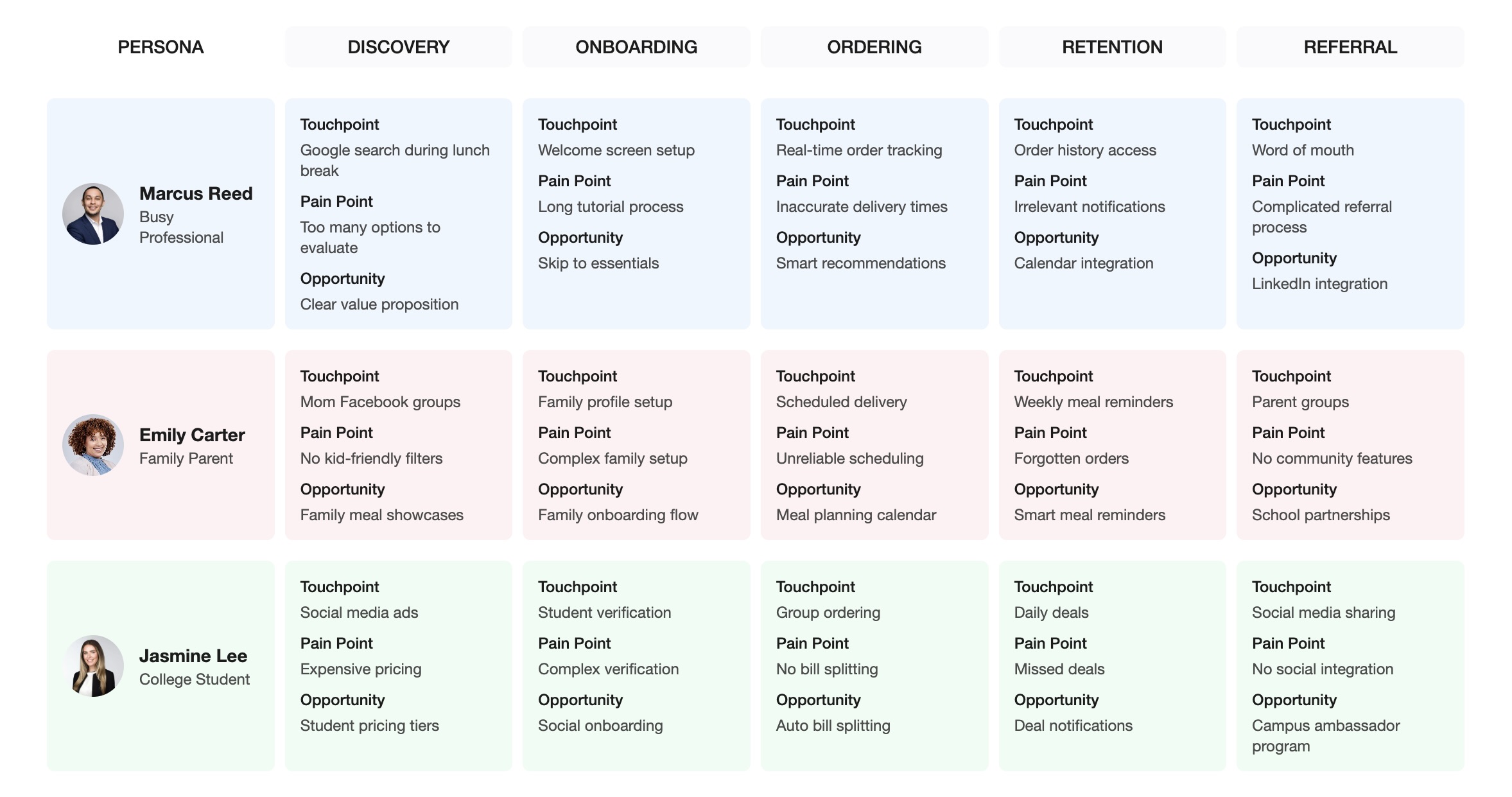
- Discovery: Personalized onboarding, curated restaurant lists, and targeted promotions.
- Ordering: Streamlined menu navigation, one-tap reorder, and group ordering for families and students.
- Tracking: Real-time order status, proactive notifications, and transparent ETAs.
- Delivery: Contactless handoff, instant feedback, and loyalty rewards.
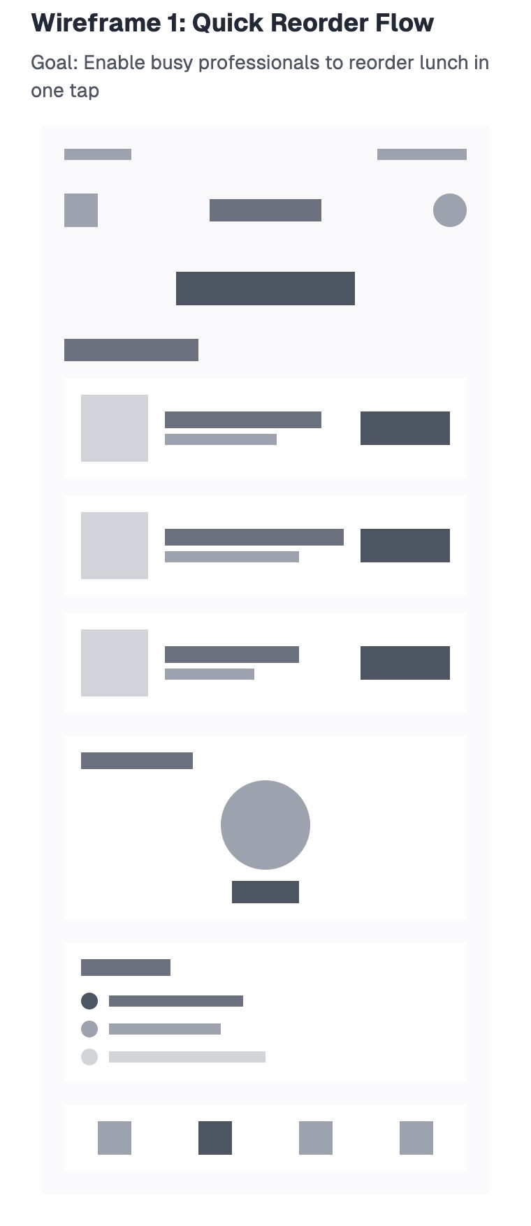
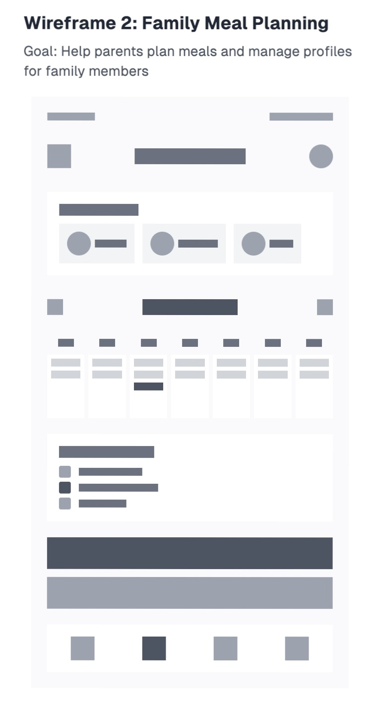
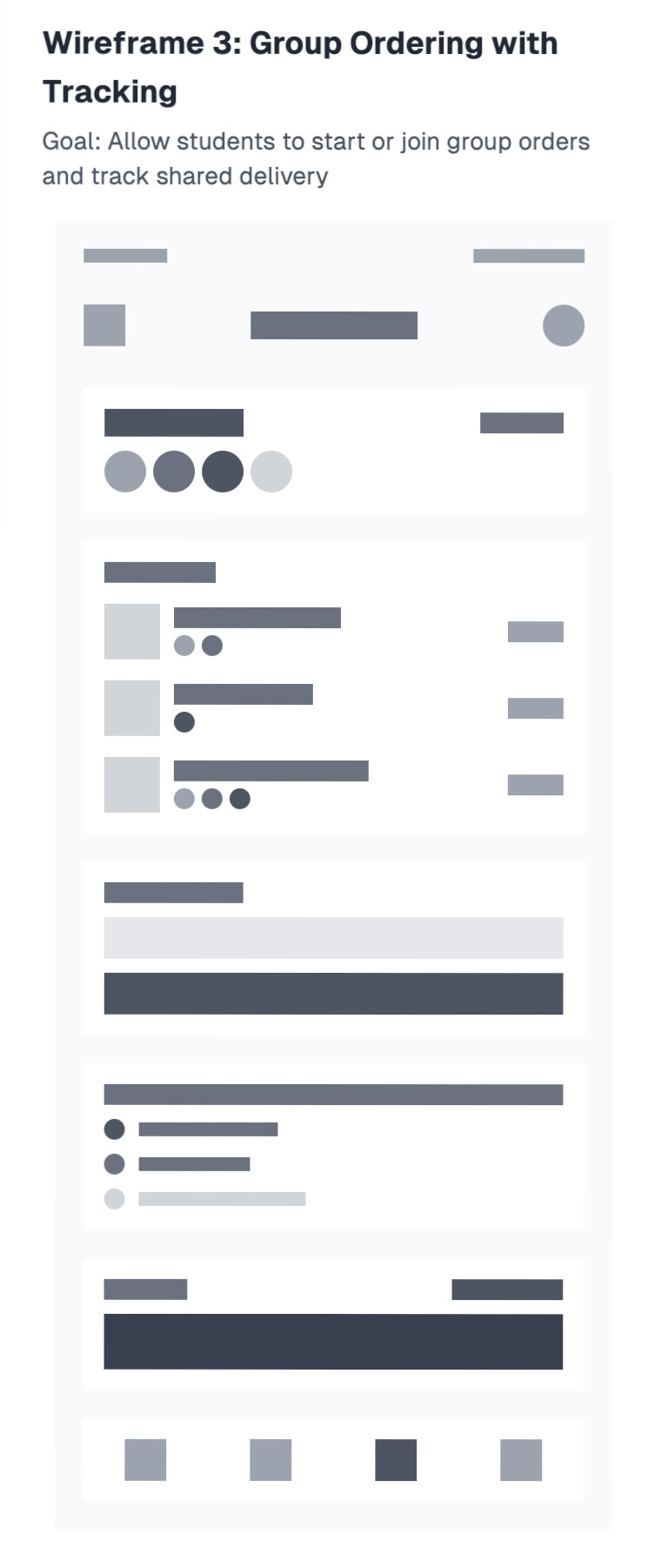
Low-Fidelity Prototypes
Before moving into high-fidelity design, I explored core flows and layouts through quick, low-fidelity sketches. These wireframes allowed rapid iteration and feedback, focusing on structure and usability without the distraction of color or branding.
Mid-Fidelity Prototype
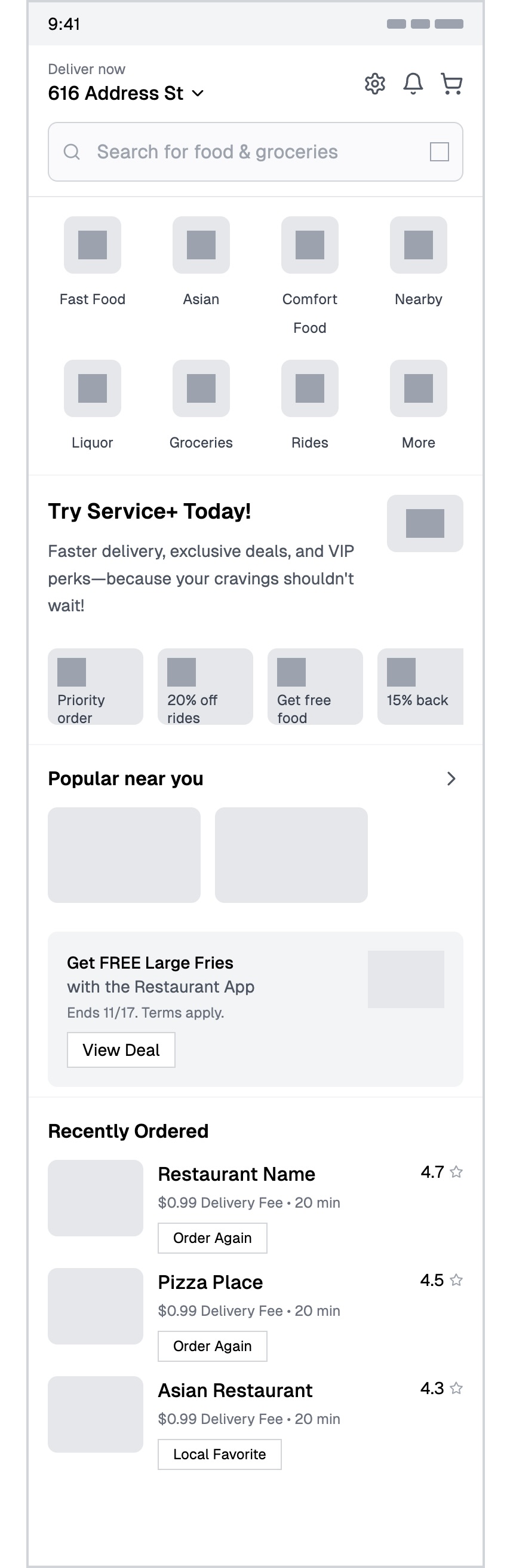
Why Mid-Fidelity?
This mid-fidelity prototype helped validate the core layout and interaction flow before high-fidelity visuals. It focused on navigation, information hierarchy, and key user tasks, allowing for rapid iteration and feedback before investing in detailed design.
The prototype tested critical user flows including restaurant discovery, menu browsing, order customization, and real-time tracking. User feedback at this stage revealed important insights about navigation patterns and information architecture that shaped the final design.
Click the preview to expand and view the full vertical prototype with all screens and interactions.
Visual Design System
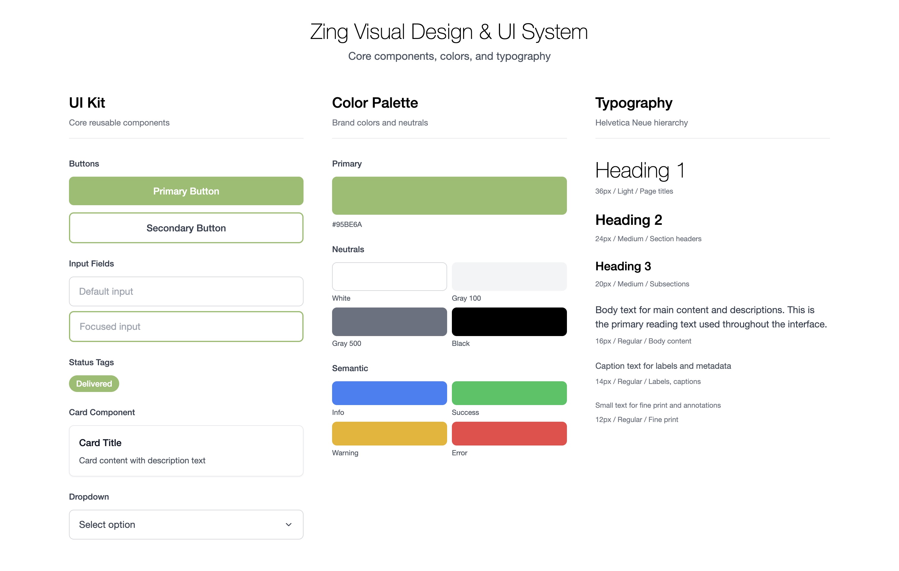
Design System Philosophy
The Zing design system was created to ensure every user touchpoint feels clear, modern, and trustworthy. Inspired by Swiss design, it emphasizes grid, alignment, and visual clarity. Every element—from color to spacing—reinforces the brand's promise of reliability and ease.
- Color: Zing's palette is led by a fresh green (#95BE6A) for positivity and action, with bold red (#ff0000) for highlights, and a foundation of white, black, and soft gray for clarity and contrast.
- Typography: Helvetica Neue is used throughout for its neutrality and legibility, with clear hierarchy in headers, subheaders, and body text.
- Spacing & Layout: Generous padding, consistent margins, and a modular grid keep the interface open and easy to scan.
- Components: Buttons, cards, and forms are designed for accessibility and touch, with subtle shadows and rounded corners for a friendly, modern feel.
How the Design System Supports Zing
The system enables rapid prototyping and consistent handoff to engineering, while ensuring every new feature or page feels cohesive. It's flexible enough to support future growth, new features, and evolving user needs—while always keeping clarity and usability at the core.
Ultimately, the design system is what makes Zing's experience feel seamless, delightful, and uniquely its own.
Final Design Showcase
Here's how we translated user needs into real UX flows. The final design prioritizes clarity, speed, and trust—creating an experience that feels both familiar and delightfully new.
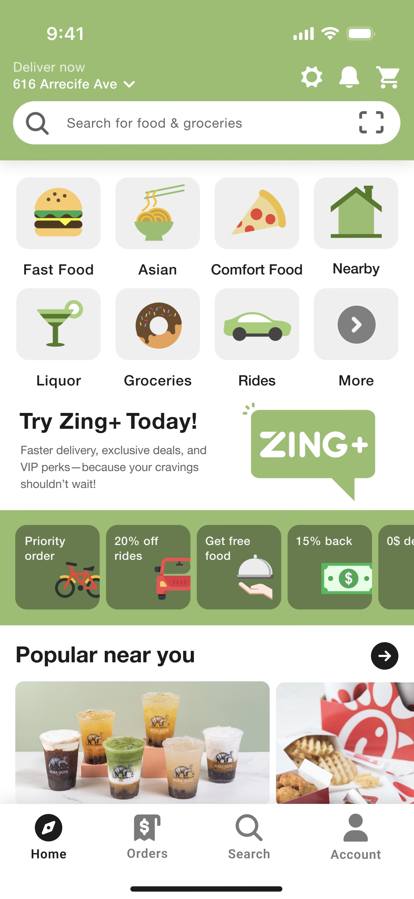
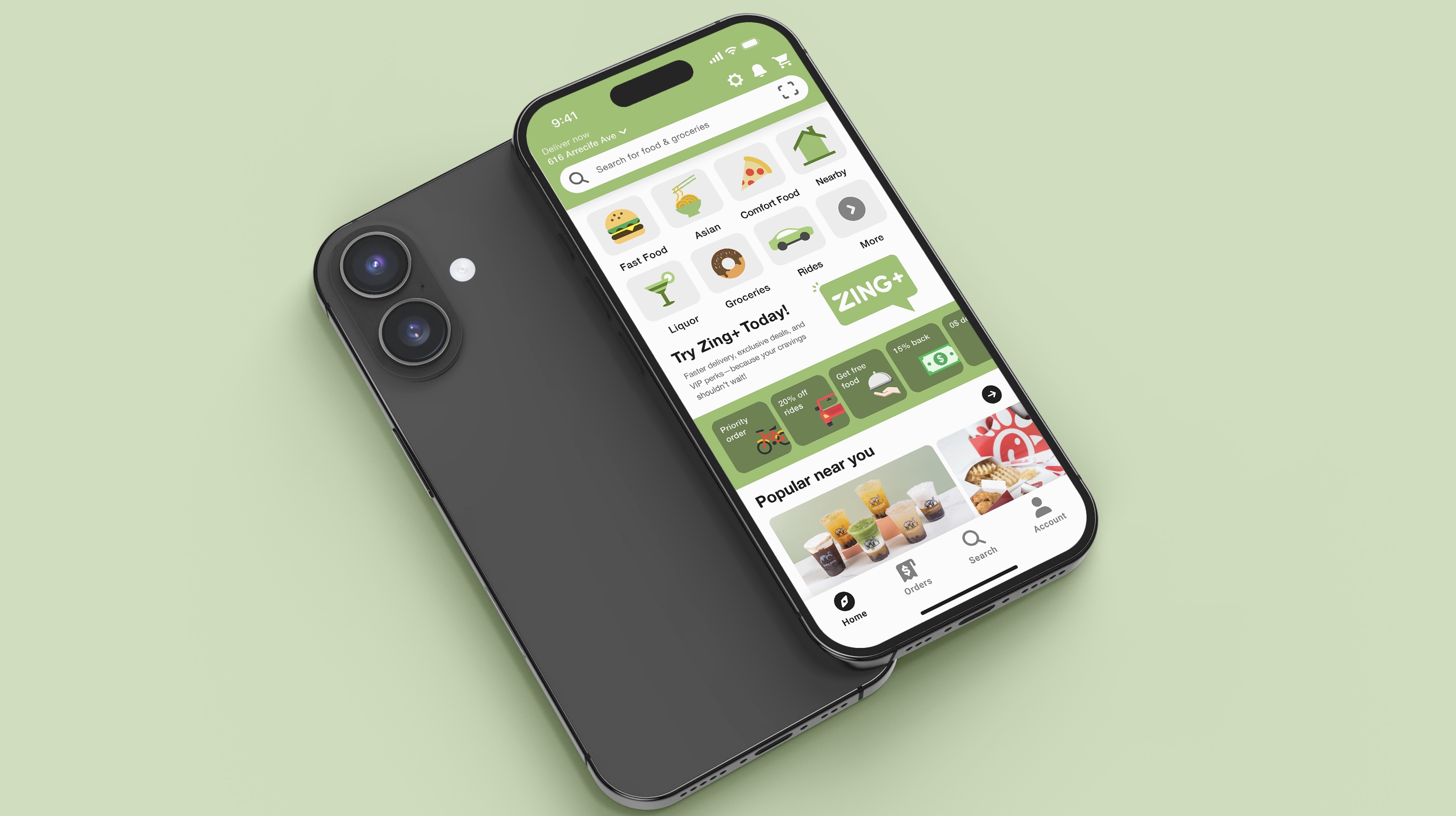
Home Screen
Category browsing with Zing+ integration and personalized offers for quick decision-making
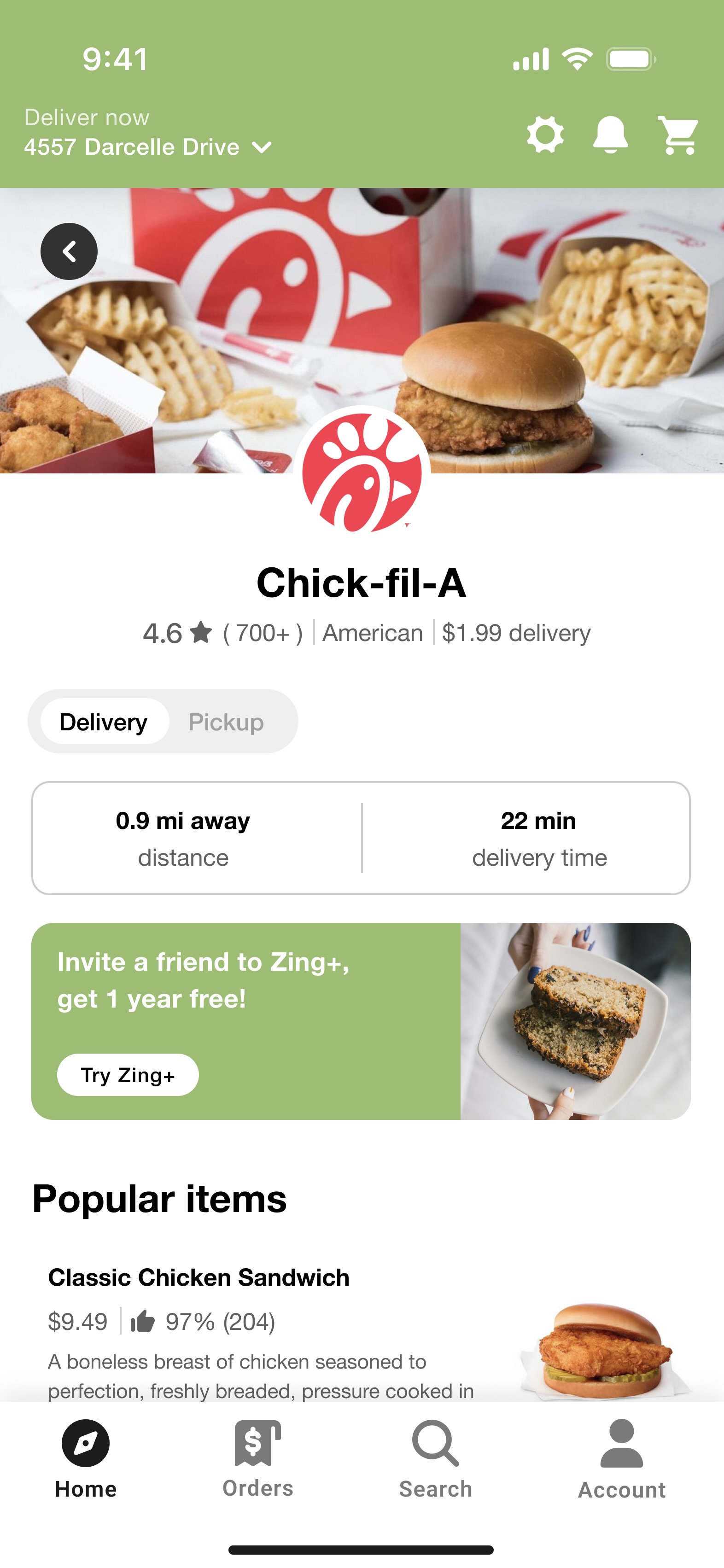
Restaurant Detail Page
Chick-fil-A showcase with delivery time, ratings, and Zing+ upsell banners
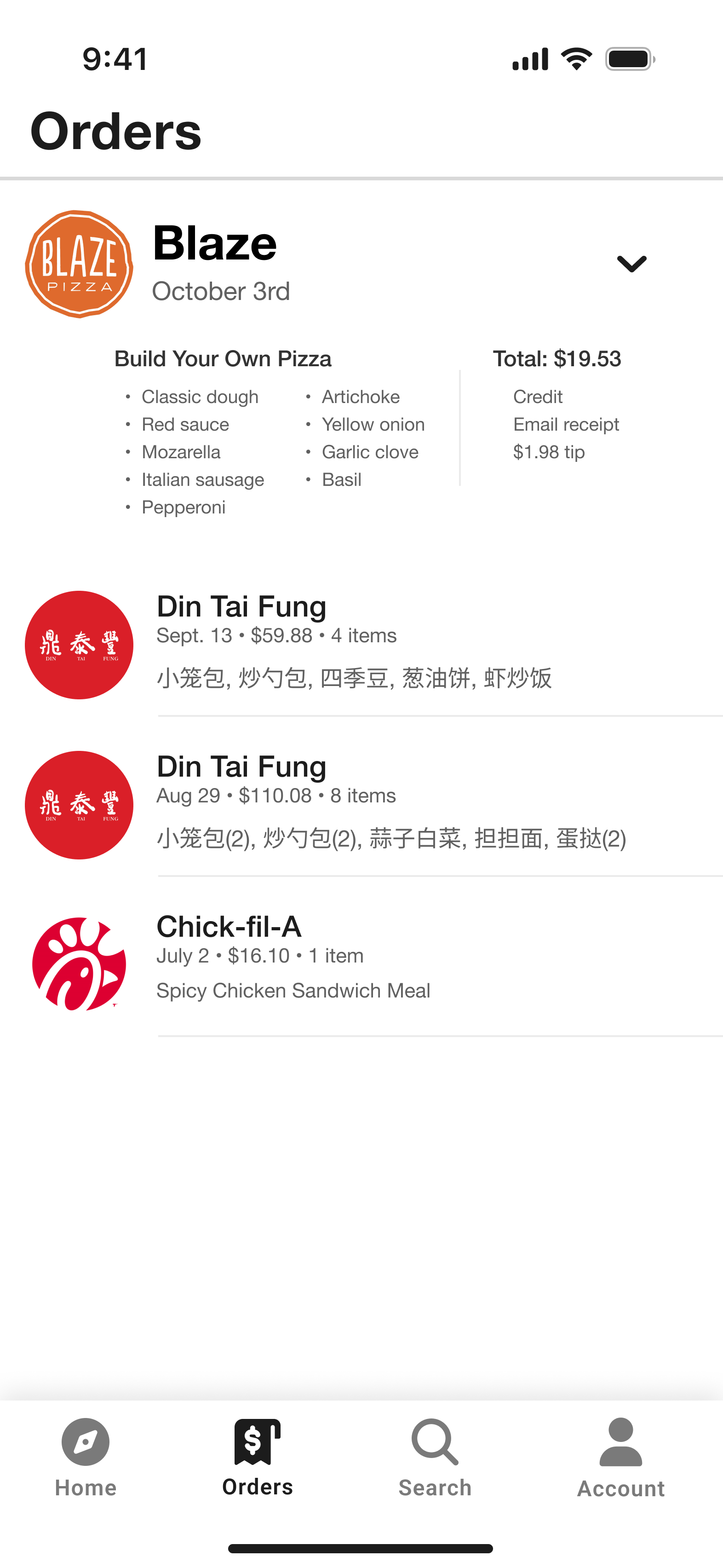
Orders History Page
Clean itemized breakdown with vendor branding and receipt access
Key Design Decisions
Category-Driven Discovery
Home screen prioritizes category browsing over search, enabling users to quickly explore options and discover new restaurants.
Branded Restaurant Experience
Restaurant detail pages showcase authentic branding while maintaining Zing's design system for consistency and trust.
Zing+ Integration
Premium features seamlessly integrated throughout the experience, with clear value propositions and non-intrusive upsell opportunities.
Order History Clarity
Clean, itemized order history with vendor branding and detailed receipts for easy reference and reordering.
Interactive Prototype
Outcomes & Impact
The Results Speak for Themselves
Zing's redesign delivered measurable improvements across every key metric, transforming the user experience and business performance.
What Users Are Saying
"The new Zing app is so much easier to use. I can reorder my favorites in seconds and always know when my food will arrive."
"Group ordering has made family dinners so much simpler. The kids love picking their meals, and I love the reliability."
Business Transformation
Market Position
The redesign strengthened Zing's competitive position, leading to a 28% increase in new user signups and improved customer retention rates.
Positive app store reviews and word-of-mouth referrals increased, helping Zing stand out in a crowded market.
Operational Efficiency
Restaurants and delivery partners reported a 35% reduction in order errors and a 20% improvement in delivery time accuracy.
Customer support volume dropped significantly, freeing up resources for growth initiatives.
Key Learnings & Reflections
User Research is Everything
Early interviews and journey mapping revealed pain points we never would have guessed. The insights from real users completely reshaped our approach to the redesign.
Mobile-First Design is Non-Negotiable
The majority of Zing's users order on their phones, so every decision was made with mobile in mind. This approach paid off with significantly improved mobile engagement.
Iterative Prototyping Pays Off
Multiple rounds of user testing led to a dramatically better product. Each iteration revealed new insights that we couldn't have anticipated in the initial design phase.
Looking Forward
Enhanced Onboarding
A more robust onboarding flow could further reduce drop-off for new users
Deeper Analytics
More granular tracking would help us understand user behavior and optimize flows faster
Advanced Features
AI-powered recommendations and predictive ordering could further enhance the experience
What I Learned
- User research is everything: Early interviews and journey mapping revealed pain points we never would have guessed.
- Mobile-first design is non-negotiable: The majority of Zing's users order on their phones, so every decision was made with mobile in mind.
- Iterative prototyping pays off: Multiple rounds of user testing led to a dramatically better product.
- Cross-functional collaboration: Working closely with engineering and business stakeholders ensured our solutions were feasible and impactful.
What I'd Do Differently
- Start usability testing even earlier: Some navigation issues could have been caught in the wireframe stage.
- Invest more in onboarding: A more robust onboarding flow could further reduce drop-off for new users.
- Deeper analytics: More granular tracking would help us understand user behavior and optimize flows faster.
Future Vision
The Zing redesign is just the beginning. We're planning to expand group ordering features, integrate loyalty rewards, and continue iterating based on user feedback. Our goal is to make Zing the most user-friendly, reliable food delivery platform on the market.
I'm excited to keep learning from our users and to push the boundaries of what's possible in food delivery UX.